
Every year, there’s that one color everyone in the design world suddenly starts talking about. If you’ve been scrolling through home inspiration pages and noticed a calm, soft white showing up everywhere, that’s not a coincidence. It’s Cloud Dancer, the Pantone Color of the Year for 2026, and it’s quietly taking over living rooms, bedrooms, and everything in between.
If you’re wondering how to actually bring this color into your own space without it feeling boring or flat, you’re in the right place. This guide walks you through practical, real ways to use this year’s color trend so your home feels fresh, calm, and put together.
Pantone has been naming a color of the year since 1999. Each year, Pantone selects a shade meant to represent and define the upcoming year, acting as a kind of prediction for the world’s mood and culture. It’s not just a marketing gimmick. It often shows up across fashion, design, and lifestyle industries as a reflection of broader trends people are already gravitating toward.
For 2026, that color is Cloud Dancer, a soft, structural white described as a calming presence that gives other colors room to shine. It’s meant to feel ethereal, soothing, and like a fresh start.
This makes it an easy color trend forecast to work with, since white pairs naturally with almost everything you already own.
Understanding the Color Before You Decorate
Before jumping into ideas, it helps to know what makes this shade different from a plain white wall. Cloud Dancer has a balanced mix of cool and warm undertones, which means it can adapt and blend depending on what you pair it with.
This is good news if you’re worried about color matching. Pastel and neutral tones work especially well alongside it, creating subtle shifts that feel calm rather than clashing.
1. Cloud Dancer Walls With Warm Wood Accents
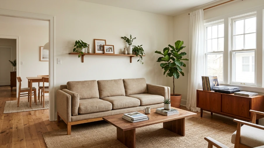
A soft white wall paired with warm wood furniture creates an inviting, grounded feel. This combination works in almost any room and avoids the cold, clinical look that sometimes comes with all-white spaces.
2. Layered Textures Instead of Bold Patterns
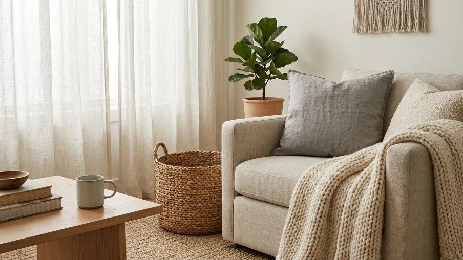
Since the color itself is subtle, texture becomes your best styling tool. Think woven baskets, linen curtains, or a chunky knit throw. This adds depth without needing extra color.
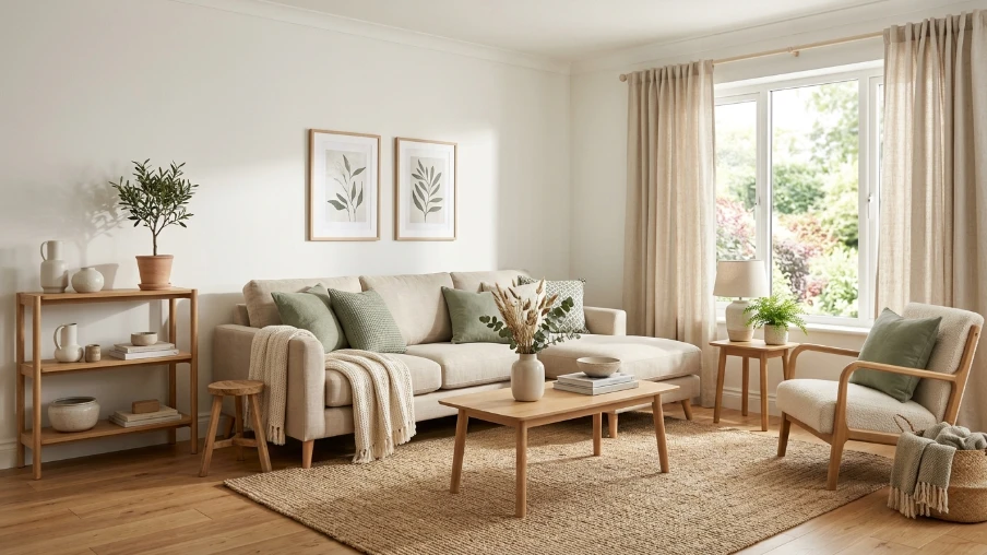
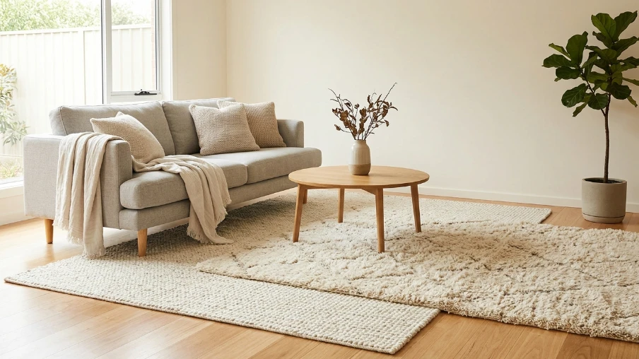
3. Living Room Color Palette With Soft Neutrals
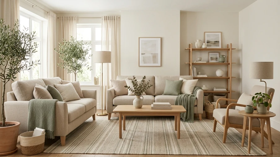
For a calming living room, combine Cloud Dancer walls with beige sofas, light oak furniture, and one muted accent color like sage or dusty blue. This creates visual harmony without feeling sterile.
4. Bedroom Inspiration With Quiet Luxury Vibes
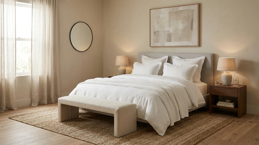
A bedroom styled around this shade feels like a retreat. Pair white bedding with natural fiber rugs and soft ambient lighting for a space that feels both elegant and restful.
| Room | Suggested Pairing Color | Texture Idea | Mood Created | Budget Tip |
|---|---|---|---|---|
| Living Room | Sage green | Woven baskets | Calm and grounded | Add throw pillows instead of repainting |
| Bedroom | Soft beige | Linen bedding | Restful and quiet | Swap curtains only |
| Kitchen | Warm wood tones | Open shelving | Clean and airy | Update cabinet handles |
| Bathroom | Pale blue | Cotton towels | Spa-like freshness | Add a bath mat and candles |
| Home Office | Muted charcoal | Matte finishes | Focused and clear | Use a desk organizer set |
| Dining Room | Terracotta accent | Ceramic dishware | Warm and welcoming | Add a table runner |
5. Accent Wall With a Bolder Complementary Shade
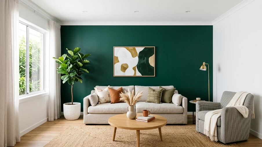
If an all-white room feels too plain for your taste, try one accent wall in a deeper tone like Phthalo green or muted plum. This keeps the base palette soft while adding personality.
6. Statement Lighting Fixtures
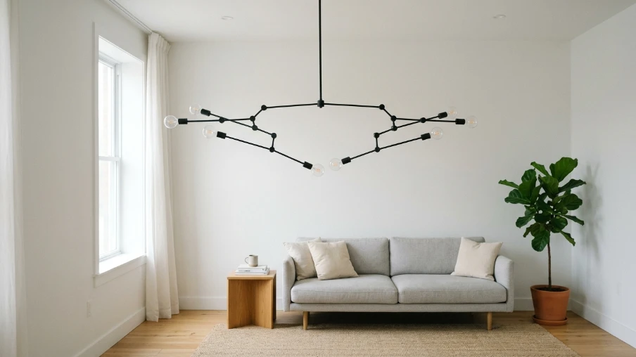
A simple white room becomes interesting fast when you add a statement light fixture. Brass, matte black, or woven pendant lights all work beautifully against this backdrop.
7. Layered White-on-White Styling
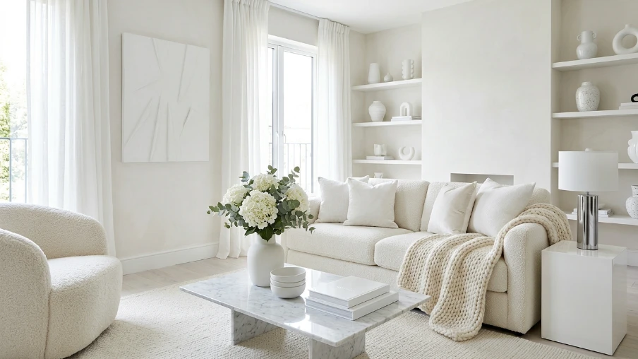
For those who love a monochrome look, layering different shades and textures of white avoids the flat, one-note effect. Mix matte and glossy finishes for contrast.
8. Natural Materials for Contemporary Aesthetics
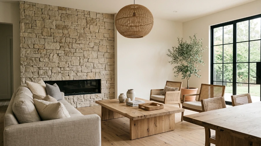
Stone, rattan, and unfinished wood bring warmth into a space that might otherwise feel too clinical. These materials pair naturally with this year’s neutral palette.
9. Soft Furnishings in Muted Tones
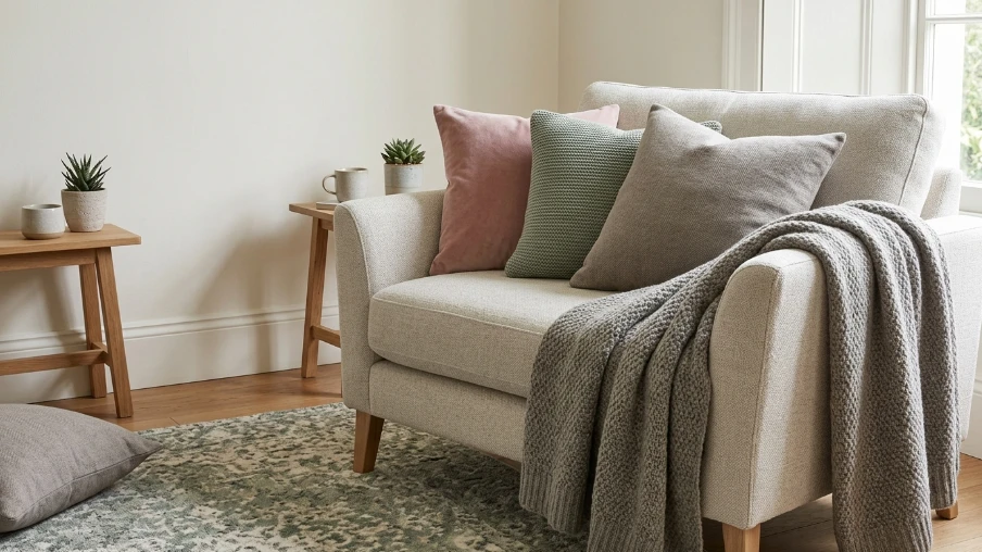
Cushions, throws, and rugs in dusty pink, sage, or warm grey add comfort and color without overwhelming the base palette.
10. Gallery Wall With Neutral Frames
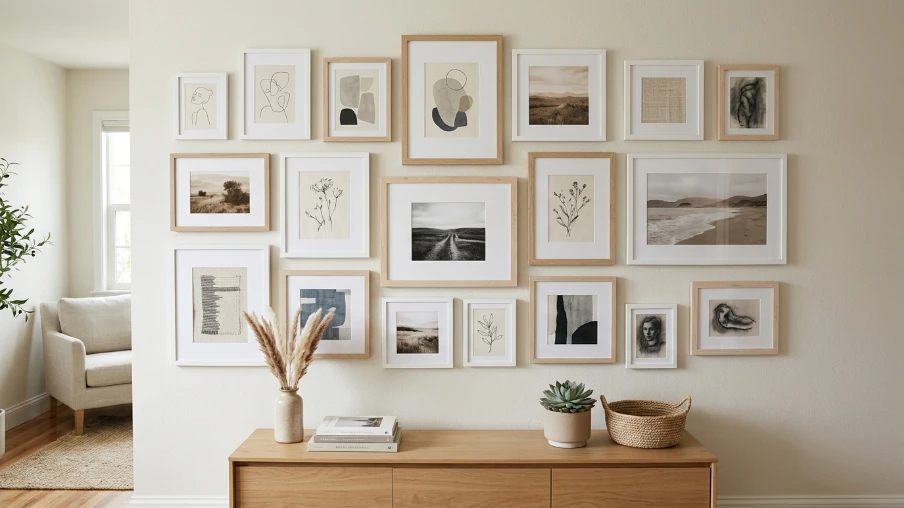
A gallery wall using white or natural wood frames keeps the focus on the artwork while staying within the same calm color family.
11. Kitchen Cabinets and Open Shelving
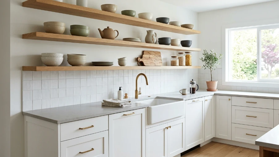
White cabinetry paired with open wood shelving feels clean and modern. Add a few ceramic pieces in muted tones to break up the monotony.
12. Bathroom Styling With Spa-Like Calm
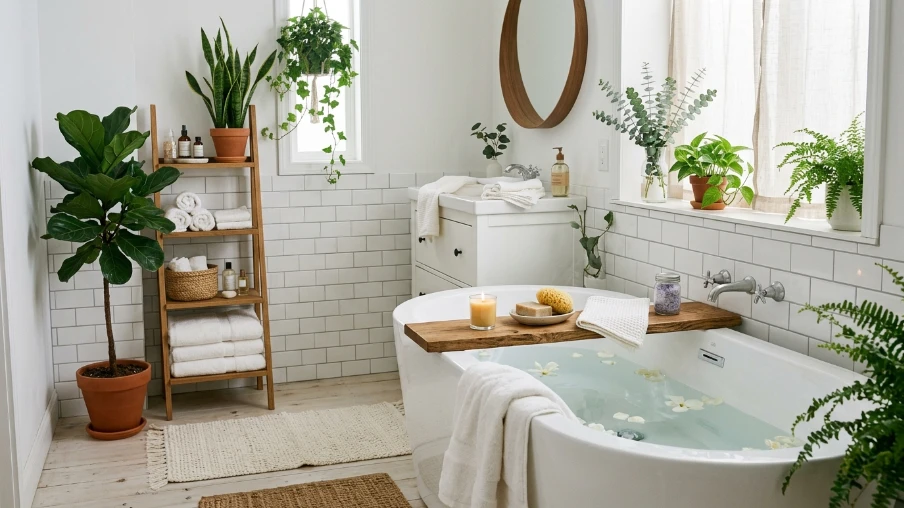
White tiles, cotton towels, and a few greenery accents turn a plain bathroom into something that feels like a small retreat.
13. Home Office With a Calming Backdrop
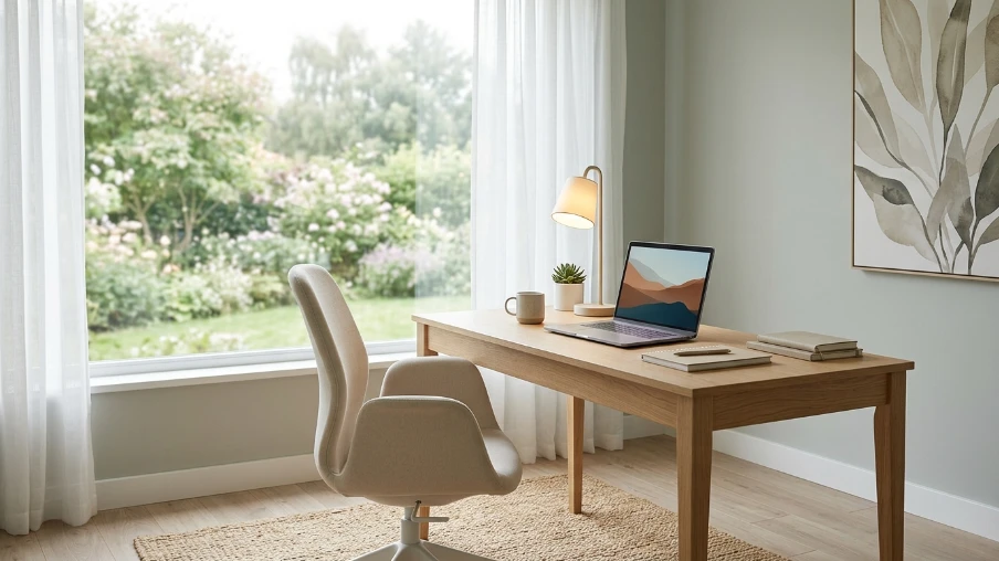
A focused workspace benefits from this softer palette. It reduces visual clutter and helps create a calmer environment for getting things done.
14. Dining Room With Warm Accents
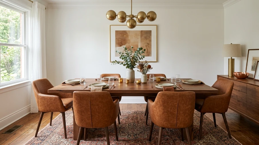
Pair white walls with a wooden table and warm-toned chairs. Add brass or copper details for a touch of sophistication.
15. Layered Rugs for Depth
Two rugs in slightly different shades of white or cream add dimension to a room without introducing new colors.
16. Ceramic and Pottery Accents
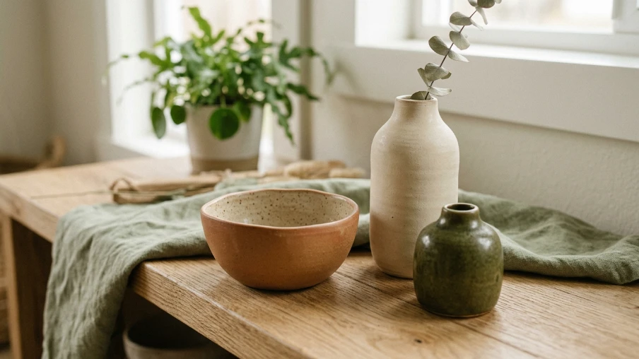
Simple ceramic vases or bowls in earthy tones complement the softness of this year’s palette while adding handmade charm.
17. Curtains and Soft Window Treatments
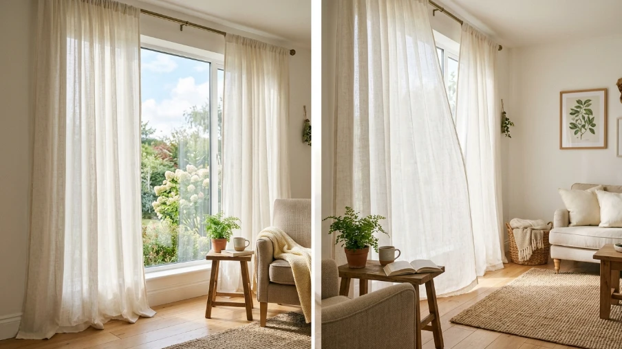
Light, airy curtains in linen or cotton enhance natural light and tie the whole room together.
you may also like this: 16 Paint Color Trends 2026 Fresh Ideas to Transform Your Home
18. Seasonal Styling With Greenery
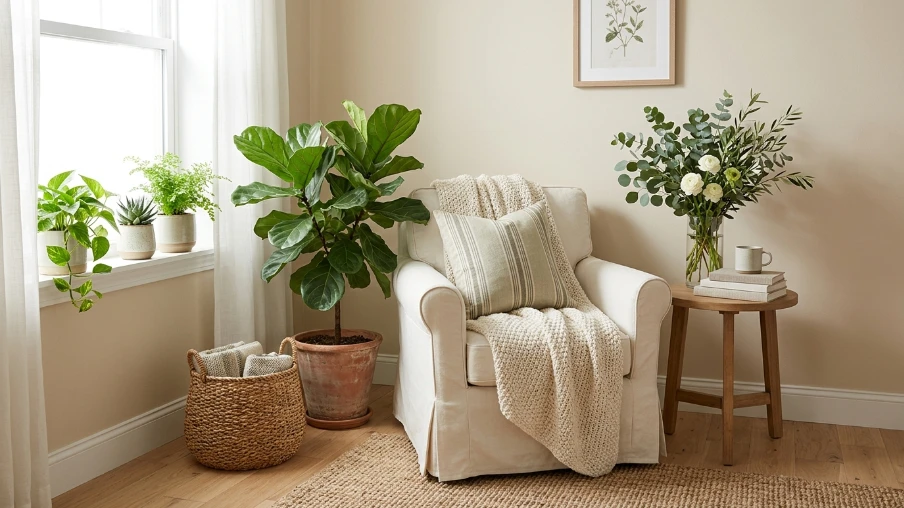
Fresh or faux greenery adds life to a neutral room. It’s one of the easiest and most budget-friendly ways to refresh a space throughout the year.
Common Mistakes to Avoid
One mistake people make is using too much of the same shade without any texture or contrast, which can make a room feel flat. Another is forgetting lighting. Cool-toned bulbs can make a warm white look greyish, so test your lighting before committing to paint.
Also, avoid skipping accent pieces entirely. A fully neutral room without any personal touches can feel unfinished rather than calm.
Conclusion
Decorating with the Pantone Color of the Year doesn’t mean repainting your entire home or buying all new furniture. It’s about understanding the mood this color brings and layering it thoughtfully with textures, accents, and a few complementary tones. With these ideas, you can bring this year’s color trend into your space in a way that feels personal, balanced, and genuinely livable.
Frequently Asked Questions
1. What is the Pantone Color of the Year for 2026?
It’s Cloud Dancer, a soft, balanced white meant to represent calm and a fresh start.
2. Does an all-white room look boring?
Not if you add texture, varied materials, and a few accent colors. Layering is key to avoiding a flat look.
3. What colors pair well with this year’s Pantone shade?
Soft neutrals like beige and sage work well, along with bolder accents like terracotta or muted plum for contrast.
4. Do I need to repaint my whole house to follow this trend?
No. Small changes like cushions, curtains, or one accent wall are enough to bring the color trend into your home.
5. Is this color suitable for small spaces?
Yes, soft white tones can make small rooms feel more open and airy when paired with the right lighting.